
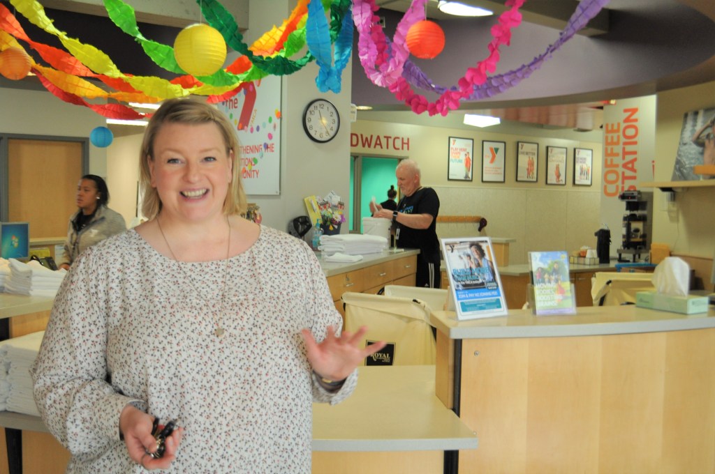
Jodi Cramer, marketing manager with the YMCA of Greater Omaha, gives a warm welcome to visitors at the Downtown YMCA, just days before the Y closed for the COVID-19 pandemic March 17, 2020. 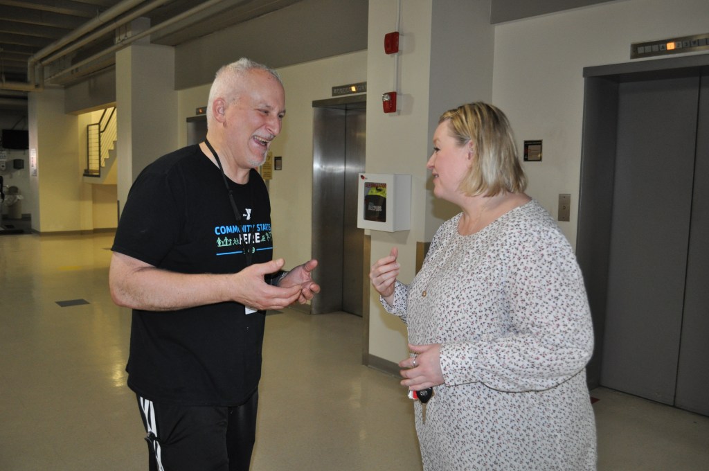
With the future rules of the COVID-19 still unknown, Jodi and staff member Robert discuss how the YMCA will communicate its news and upgraded sanitation policies with its members via Facebook and email. 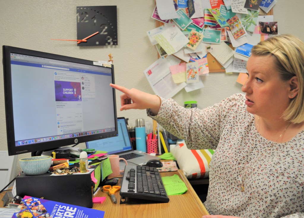
Facebook is the top social media outlet for the 10 metro area YMCAs. They all have similar looks and follow the same brand guidelines. 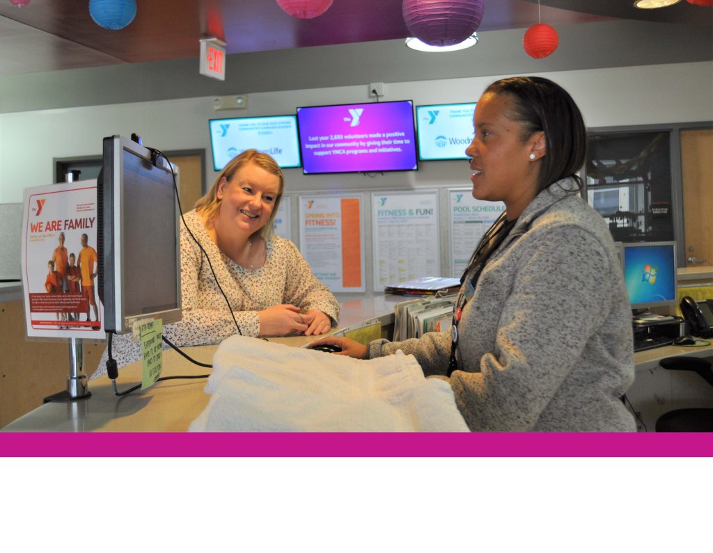
Customer service is paramount both in person and online. Cramer says this about Facebook customer service: “We have comments, good and bad. We always respond. As a rule if there’s cussing we will remove and block. If it’s critical, we will respond in a positive manner.” 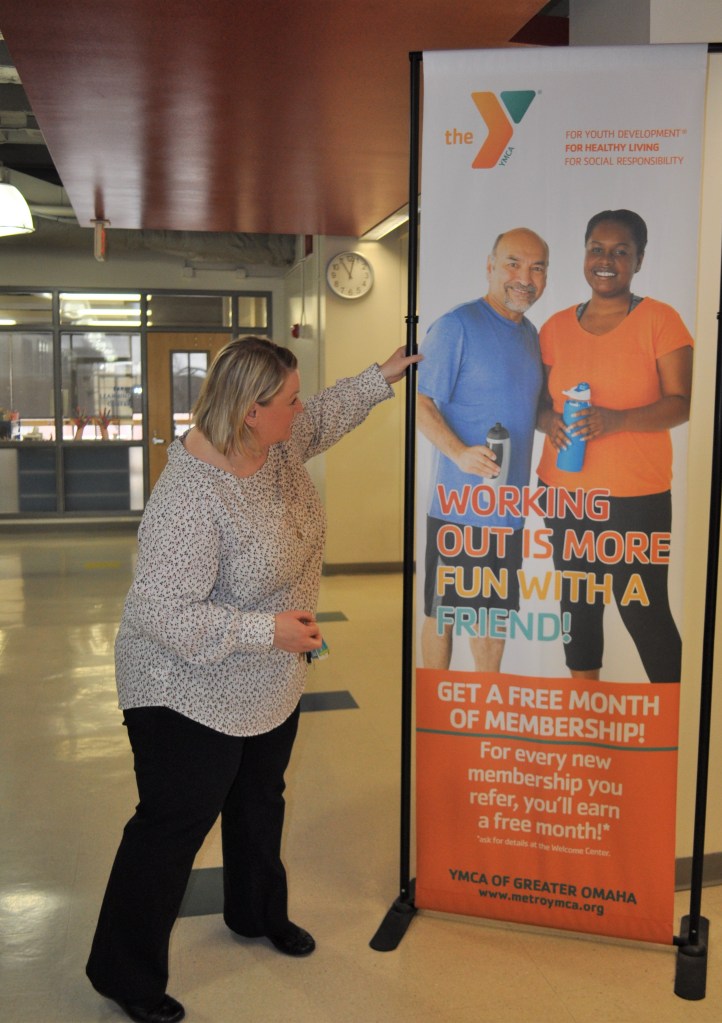
When Cramer started her position at the YMCA four years ago, she increased the sizes, colors and vibrancy of signs throughout the buildings like others nationwide. “The community starts here,” she said. 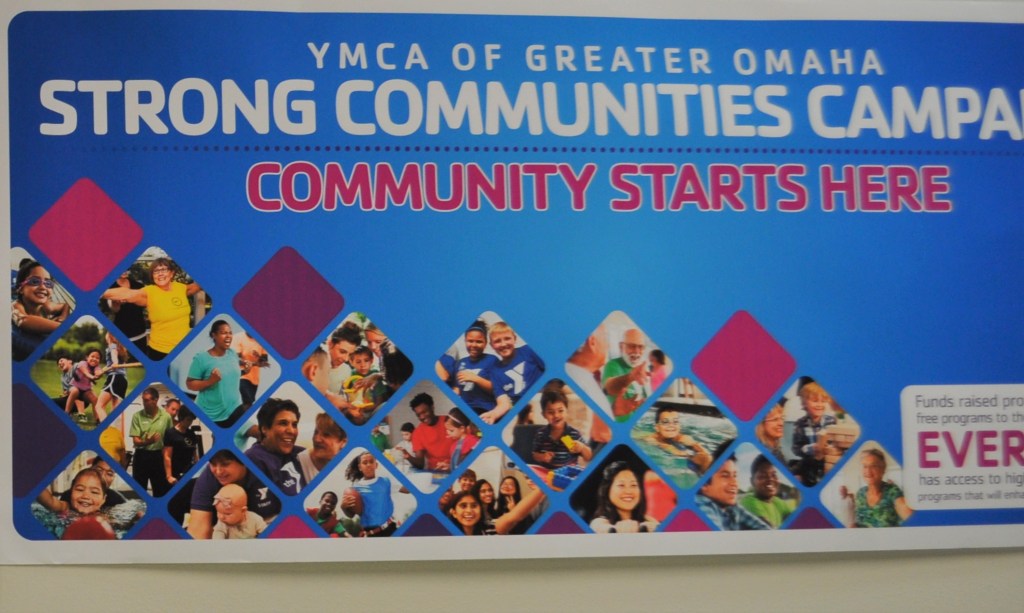
Cramer follows the YMCA’s guidelines of 17 colors, but uses her own graphic design skills for creative print and online projects. 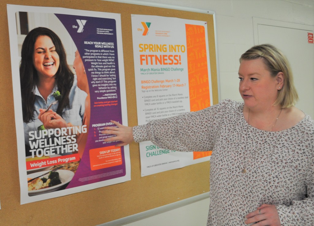
Wellness, swimming lessons and youth sports are of top importance to the Y. According to Cramer, the Y is adding a new social media position to find new audiences beyond Facebook for sharing its opportunities. 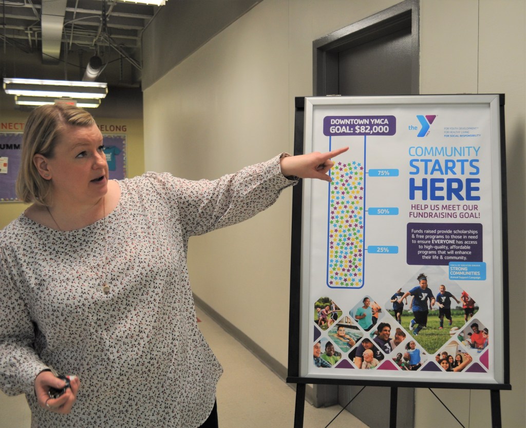
Yearly fundraising by each building provides scholarships for youth. The Y uses paid Facebook advertising for its donation campaigns. 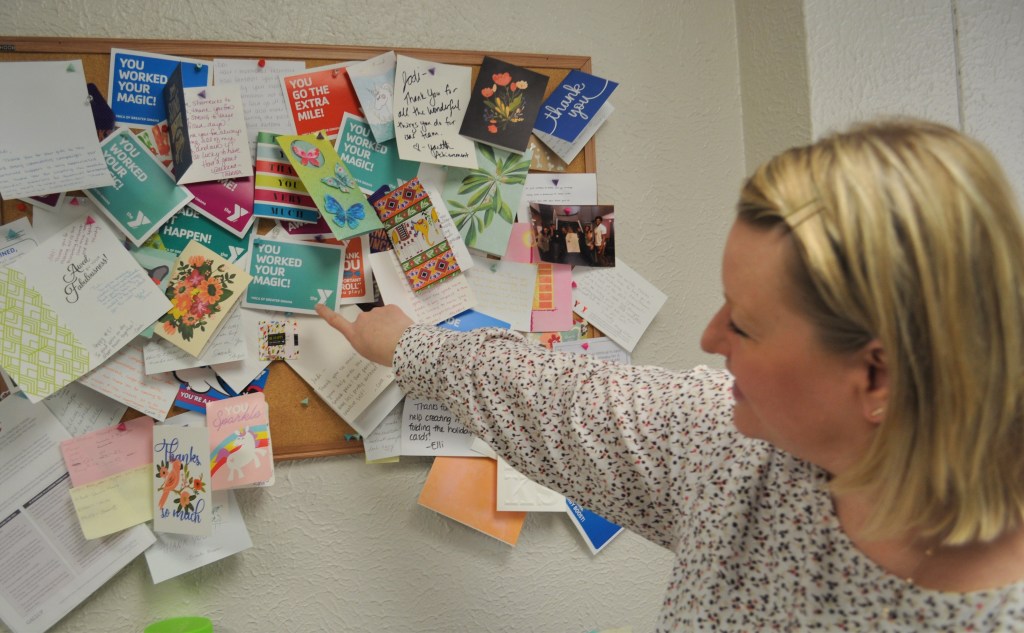
The thank you notes lining Cramer’s office show large community support and engagement for the Y’s programs. 
The Y is now encouraging members to maintain their memberships during the COVID-19 crisis, as these fees cover facilities and staff costs. Yearly paid membership campaigns use Facebook ad placement.
The visual change may not be as noticeable to long-time members, but for a prodigal member returning to the Y, the changes are immediate.
From colorful signage, to an online presence with a focus on telling the stories of its members and its open-arms policy, the Omaha metro area YMCAs have a visual and expanding presence in the community.
According to Jodi Cramer, marketing manager for the YMCA of Greater Omaha, using social media and colorful graphics is large component of the Y’s branding and outreach. Over the last decade, nationwide YMCAs have dropped the two-color black/red color scheme from the Young Men’s Christian Association to the colorful and inclusive new name – the Y.
“Our strategy is to tell the story of the Y,” she said.
“Our logo is bold, active and welcoming, and it adds color and vibrancy to our identity.”
As the Y has been incorporating its new identity changes, it is also looking to increase its online presence with a new staff member for a social media position.
Cramer said the social media presence right now for the metro area Y’s 10 locations is mostly found on Facebook. The pages are cohesive, follow brand guidelines, are colorful but reach mainly an older audience. Soon, the Y will be forging into Instagram and Twitter.
“We will have a social media plan for each week, and each branch will have its own goal for fundraising and support. We are not there yet, but we are stepping up,” said Cramer.
